A CONTENT STRATEGY DRIVEN DESIGN SYSTEM
'“its in the game,” & now in web and mobile experiences too
A software redesign to support a modern Unity-based experience for a web & iPad, with a mobile companion app that provides a support service for surgeons to plan a crucial step in a Total Shoulder Arthroplasty. Another focus of this redesign effort was to align UI components, icons, symbols, and illustrations across new product builds and updates across our ecosystem, as a starting point for our design system.
Personae
Designers and Developers need a way to move faster, share cross-product, and focus their energy mainly on strategic efforts.
My Role
UX Lead, Workshop facilitator, User research, Visual Designer, Sales
jumping in mid-project
I joined the project after it had kicked off, and the first thing we needed to do was hit the pause button to tell a clearer more complete story. The majority of the software wireframes were completed, and one feature needed updates (range of motion) after feedback from a beta launch, while a new one was to be developed (plan approvals).
Next, we worked as a team to write new need statements and tell user stories from start to finish. A thought process of each persona (patients, surgeons, and nurses).
Time to iterate
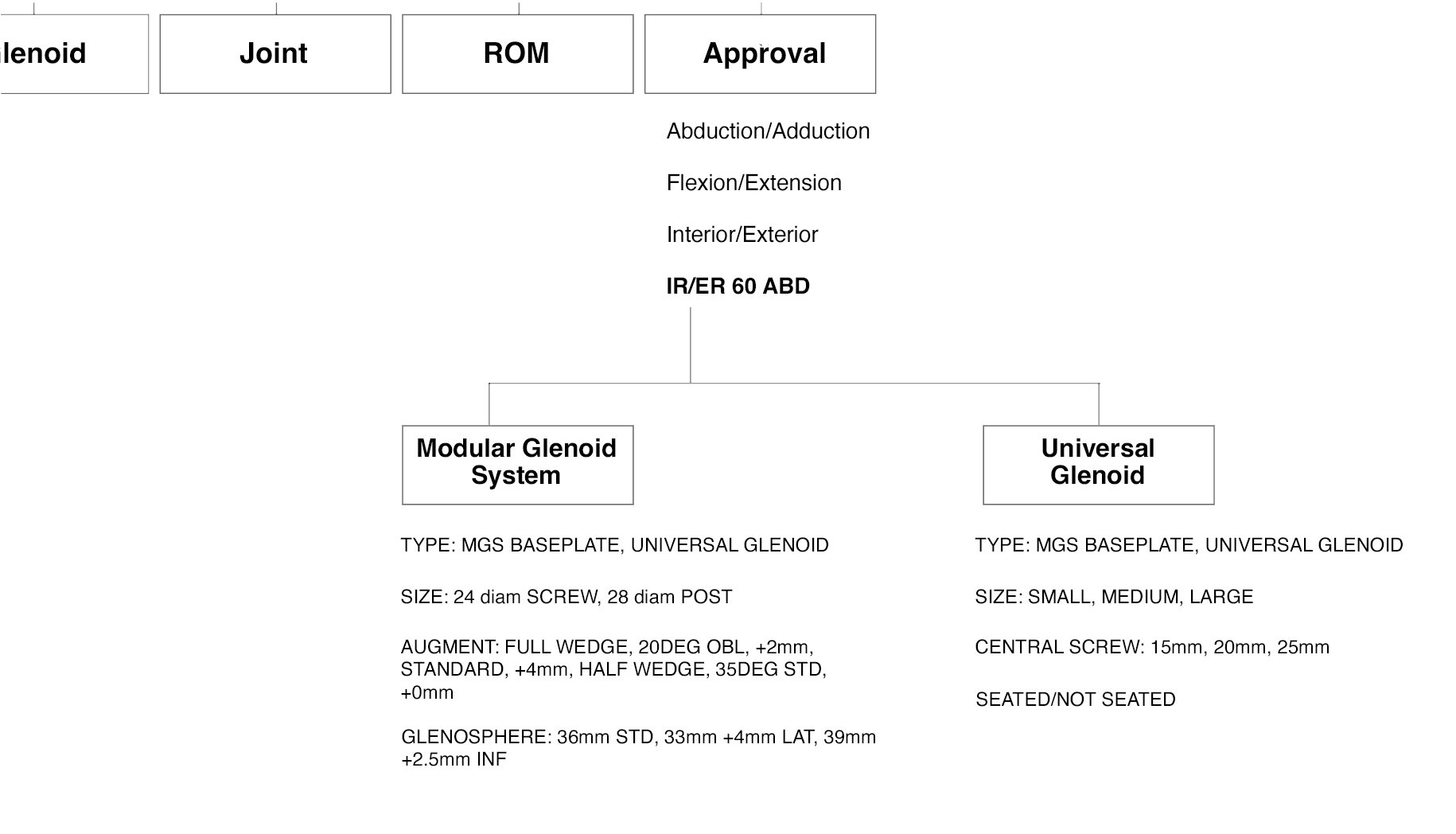
Once we had all aligned as a team and gathered feedback from surgeons and nurses, it was time to start creating designs to support our stories. I then created a sitemap to think through the experience for Surgeons and what they need to make an approval on a plan:
From there, I took key needs & moments from the stories and iterated on the approval workflow screens and the overall design of the experience.
Two main concepts started to take shape:
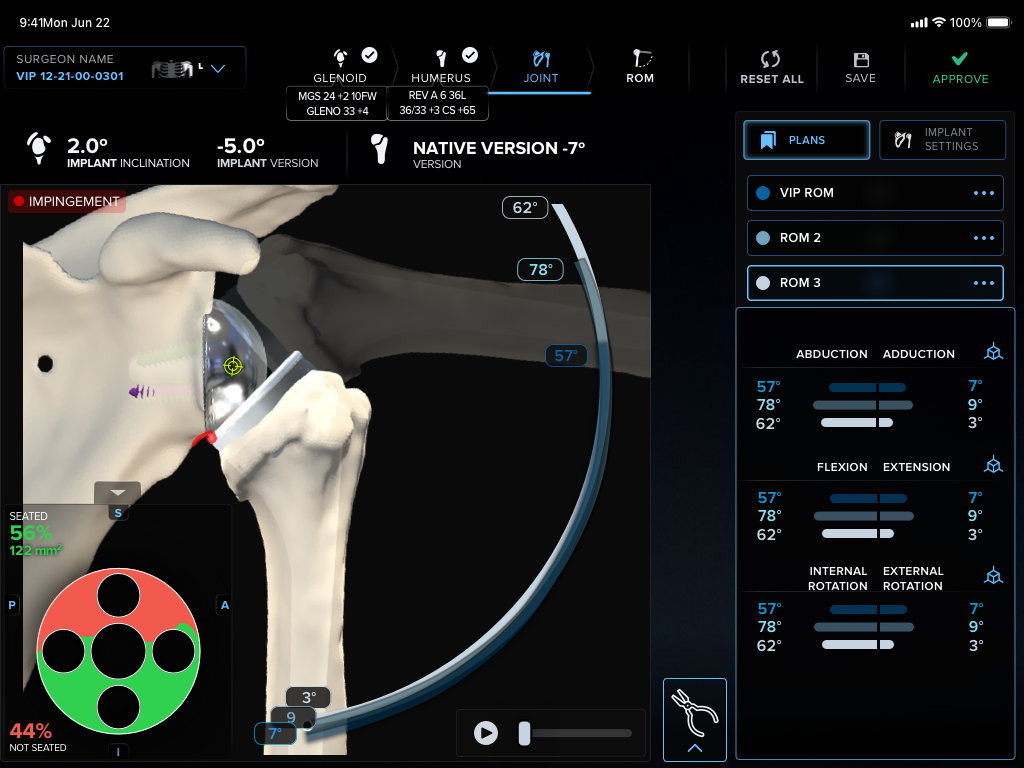
We needed to rethink our approach to feedback, signals, and motion to help reduce cognitive load of processing large amounts of critical information on screen for surgeons, as they move through 3d space in different areas of anatomy. To understand this I lead a formative assessment to measure how a surgeon are understanding the system and how to prioritize information and feedback elements in the system.
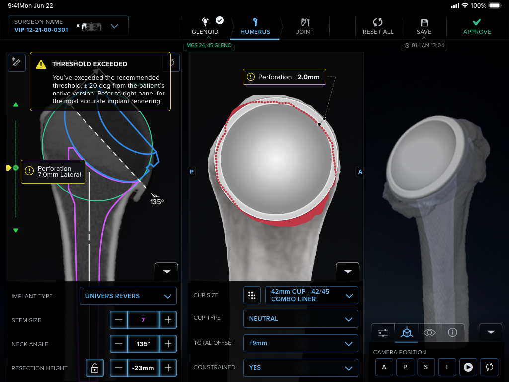
We revisited color, as we added new features and widgets and more information on the screen. So, we needed to balance color on pages with notifications, guides, and critical errors, as well as human factors. A big goal was to differentiate from all other competitors’ standard operating system look and feel.
Before & After
Redesign after color system research and definition
Updates involved a more clear story related to information architecture, as well as, redefining & creating new components and iconography that provided clearer affordance, especially on pages (like below) that had large amounts of information for surgeons to make accurate decisions for their implant surgeries.
Final direction
After rounds of user testing and stakeholder validation, we landed on a final direction that aligned our team on a picture of our product in the future, as well as a revised visual direction to bring our product into a new realm, in line with the latest and greatest Arthrex.
Mobile companion app screens for screw trajectory, which helps surgeons understand how to best achieve stable bone fixation within a total shoulder arthroplasty.
Print layouts for screw trajectory settings reference in operating room.
Below: web & iPad view (left), and mobile companion app view (right), allowing surgeons, hospitals, and surgery center admins to review case details for upcoming surgeries, as well as, historical information.
Deliver and support
My preferred way of working is an iterative process, integrating stakeholder and user feedback into the process early enough to make change. If feedback comes in after everything is buttoned up and ready to go to press, it’s often impossible to react to everything users are saying. After rounds of feedback, storytelling and revision, we ended up with final designs. I worked with our Engineering team to implement the designs and deliver a high quality experience to our clients.
Rinse, repeat
Continuous delivery means seeing a product through from start to release, and then returning to the drawing board armed with new information and real user feedback. We are constantly gathering new feature ideas and iterating on the features already in place. Please reach out if you’re curious about what’s in the works!


