

Redefining the Cannabis retail Experience
#designsystem #Branding: Customer experience, service & Learning design
The Challenge + Goal
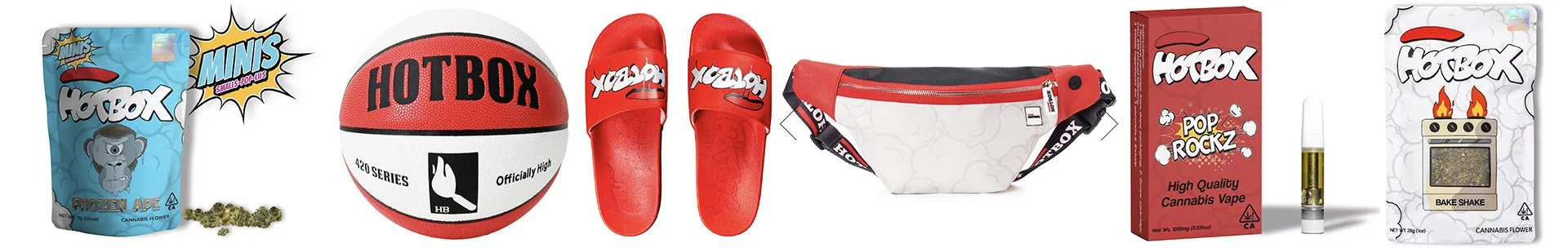
Hotbox was a brand in our product portfolio, which at this time cultivated, manufactured, and wholesaled CPG products, apparel, lifestyle gear, and accessories both in retail & direct to consumers.
The goal of this project was to design a Hotbox retail concept to consolidate a group of Americann Made owned stores under one cohesive brand identity. We had 6 new locations opening over the course of a year and a half across southern California, starting with our flagship in Los Angeles.
Personae
As a business, we wanted to articulate our brand in physical spaces in a memorable and meaningful way for our patrons. We need a model that is cost-effective & scalable at any location size.
As a patron, we want to easily find our go-to brands/products, discover new ones, and get quality info about them and their benefits & effects.
My Role
Project lead, Design Thinking facilitator, Design System SME, Research, Customer Experience, Service Design, Human factors
Collaborators
Core team: Operator, COO, Head of Retail Ops, Business Analyst (2), Visual designer (1), Industrial designers (2), Architecture agency
Other collaborators: Patrons/customers (the users), Retail teams (another user type), partner brands
Defining the path forward
I led this project from kick-off, and the first thing we needed to do was define the story we wanted to tell and its direction. We wanted to give Hotbox retail the same level of consistency, clarity, and identity that we’ve developed in our brand & product cultivation. The cannabis market was evolving legally in how we can operate, structure our businesses, communicate & market to our customers. Additionally, the personae of customers were growing, as well as their needs, wants, and expectations.
To start, we conducted a competitive analysis and researched the other markets for strategic gap solutions & some design inspiration. We already had insights from our current retail stores on operations and most importantly direct insight into the customer journey, behaviors, and insights via our loyalty programs & routine surveys.
Our key objectives
Design a Hotbox retail concept to consolidate the select stores under one cohesive identity
Differentiate the store design from your competitors to 'cut through the noise.”
Create a distinct offer that embodies Hotbox's core values, “Taste. Flavor. Clean & safe products, backed by science & organic growers.”
Build a 'toolbox' of design elements that lets you apply the concept to different site types.
Look at ways digital and social can be integrated meaningfully in-store.
Gathering content and Inspo
We took a look at our brand ethos, style guide, and expanding product line offerings, which include cannabis products, apparel, and lifestyle gear & accessories.


Workshop time
I facilitated workshops to document business and customer needs, team concepts & ideas, and how we envision customer service and product education. Key concepts started to take shape around how to articulate our brand ethos in a meaningful way and convenience as an essential experience principle to our customers and how we utilize space.

The concept


Make it tangible in the retail environment
We defined Concept Principles:
Artfully nostalgic
→ integrate brand photography
→ incorporate sculptural installations
→ nod to the familiar but give it a surprising twist
→ use analogue over digital
→ explore the use of smoke
Straight talking originator
→ use universal symbols/intuitive graphics
→ clear product categorisation
→ simplicity and order
→ visual cues to cultivation process
→ utilitarian materials

Convenience is different things to different people
We also defined Convenience Principles:
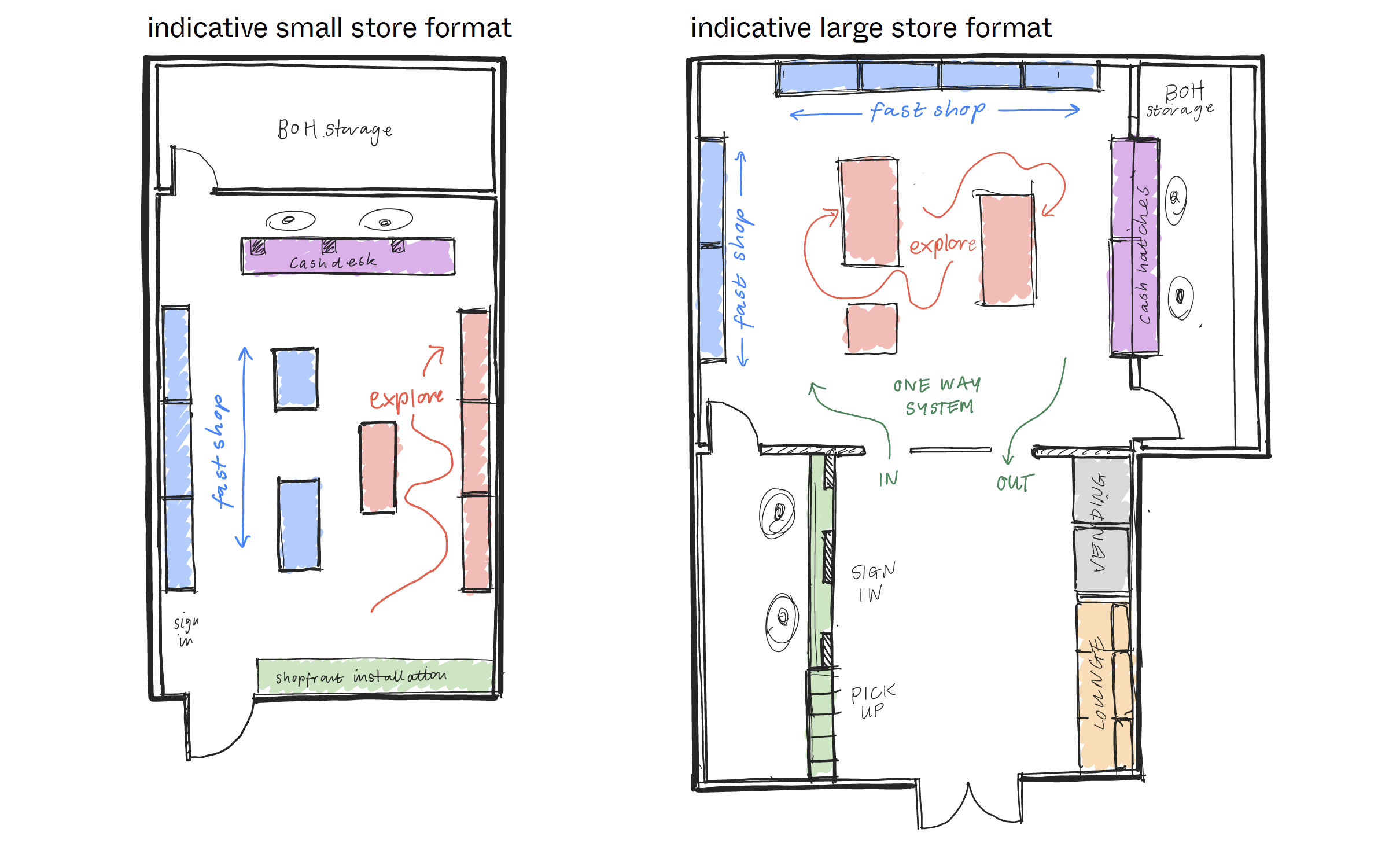
→ encourage a one-way system
→ focus slower moving store traffic to certain areas to free-up fast shopping zones
→ introduce in-store pick-up
→ offer bite-size product information
→ have a dedicated 'education' budtender/sales person
Visual Direction
The visual direction focused on Utilitarian Hedonic Multi-functional Design principles to incorporate fun, pleasure, education, and multi-use, making a design sustainable by reducing material wastage.


Harness the brand assets for intuitive communication
Navigating the store and product should be simple. Customers should be able to self-direct their search without overloading information. It's important to create a hierarchy of graphics to achieve this.
Neon signs:
→ key service touchpoints
→ high-level product categorization
Vinyl graphics:
→ Product information and call-outs
→ Infographics

Store Design
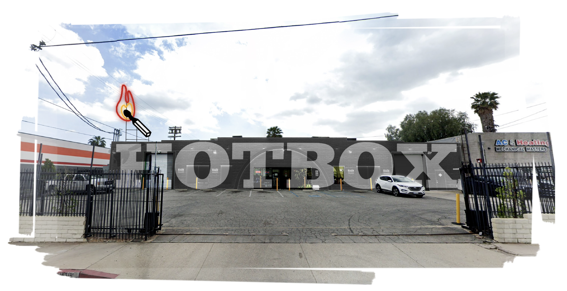
Given the diversity of stores, we focused on creating unique shopfront solutions for each site. This lets us respond to the architecture and locality while working to a site-specific budget.
All shopfronts should be high-impact and playful, creating an Social Media Worthy branded moment.
Shopfront Options:
Nod to the brand name
Install a car where you have a generous entrance space and good visibility from outside. Alternatively, brand a Hotbox car within the parking lot.

Blur digital and physical
Oversized 3D match sculpture that comes alight and burns out via a digital screen backdrop.

Large scale murals
For the bigger fa.ades with an industrial aesthetic, large-scale graphics and signage give call out and impact from a distance.


Design System - The toolbox
In collaboration with our design team & industrial designers, we created a toolbox of design elements that can be selected from to build out each store. This allows for different levels of intervention at each site.
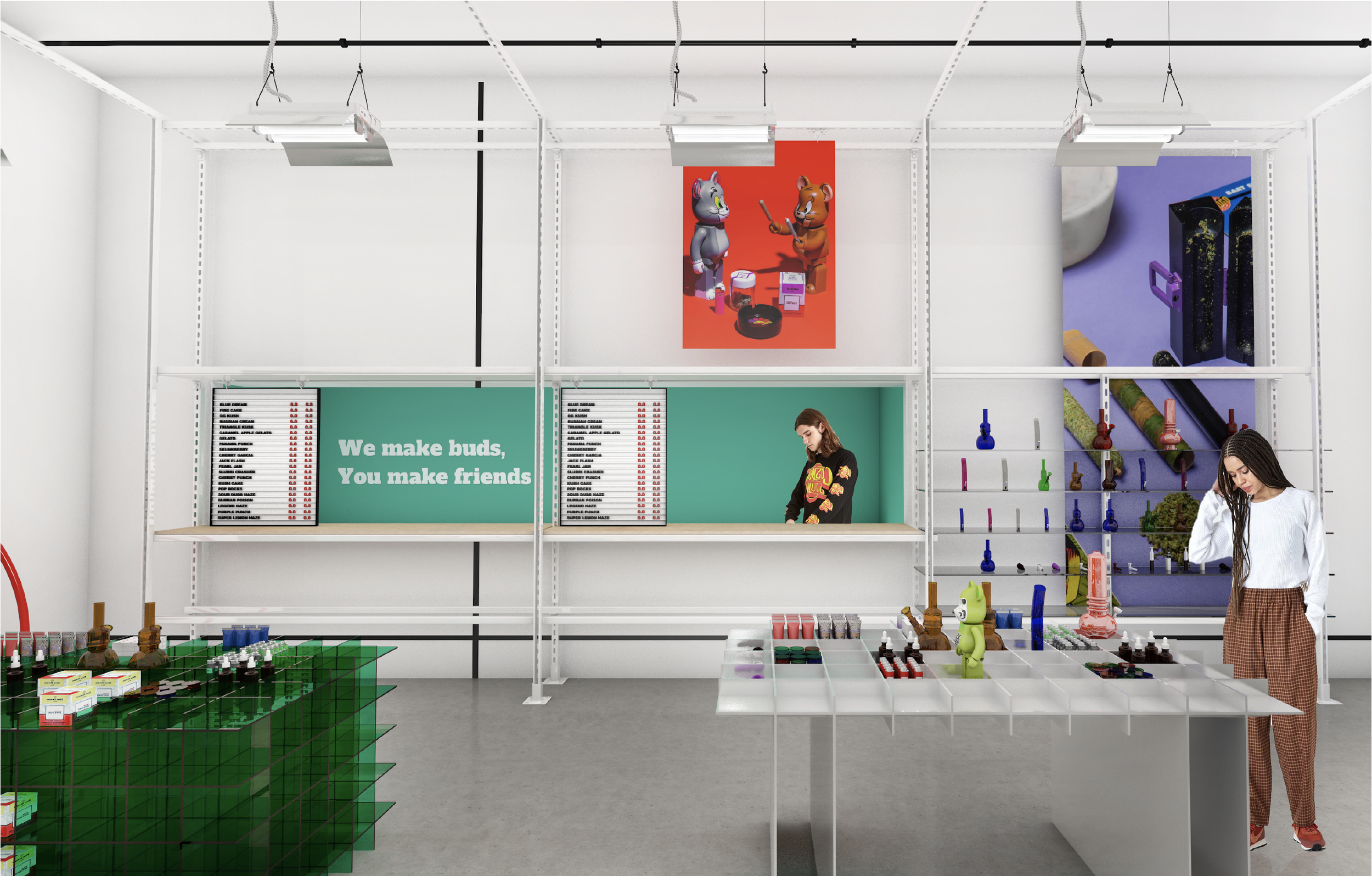
We based the first set off our flagship store, which was one of the larger ones allowing for a full expression of our toolbox with our first implementation.

Shopfront
Smoking shopfront concealing and revealing a neon Hotbox eye or logo lightbox within. The lounge seating behind let's people dwell and take photos out of the way of the store flow.


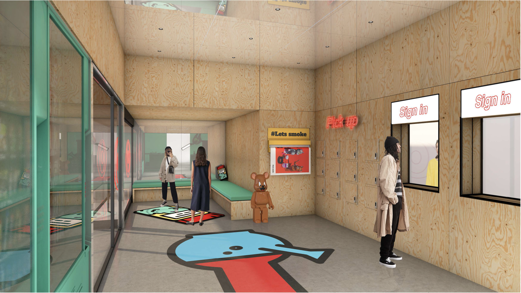
Sign-in and pick-up
The plywood-lined room feels approachable and low-key. Hatches allow people to sign into the store and code-release lockers let customers conveniently pick up pre-ordered products. Hotbox graphic icons become rugs or floor graphics.

convenience, speed, and nostalgia
For convenience and speed, we added vending machines for quick add-on purchases and other opportunities.
→ accessories: lighters, grinders, rolling trays, skins, matches, etc.
→ branded merch
→ Non-regulated products (like CBD)
→ nostalgic munchies & brand partnership opportunities

In-Store design
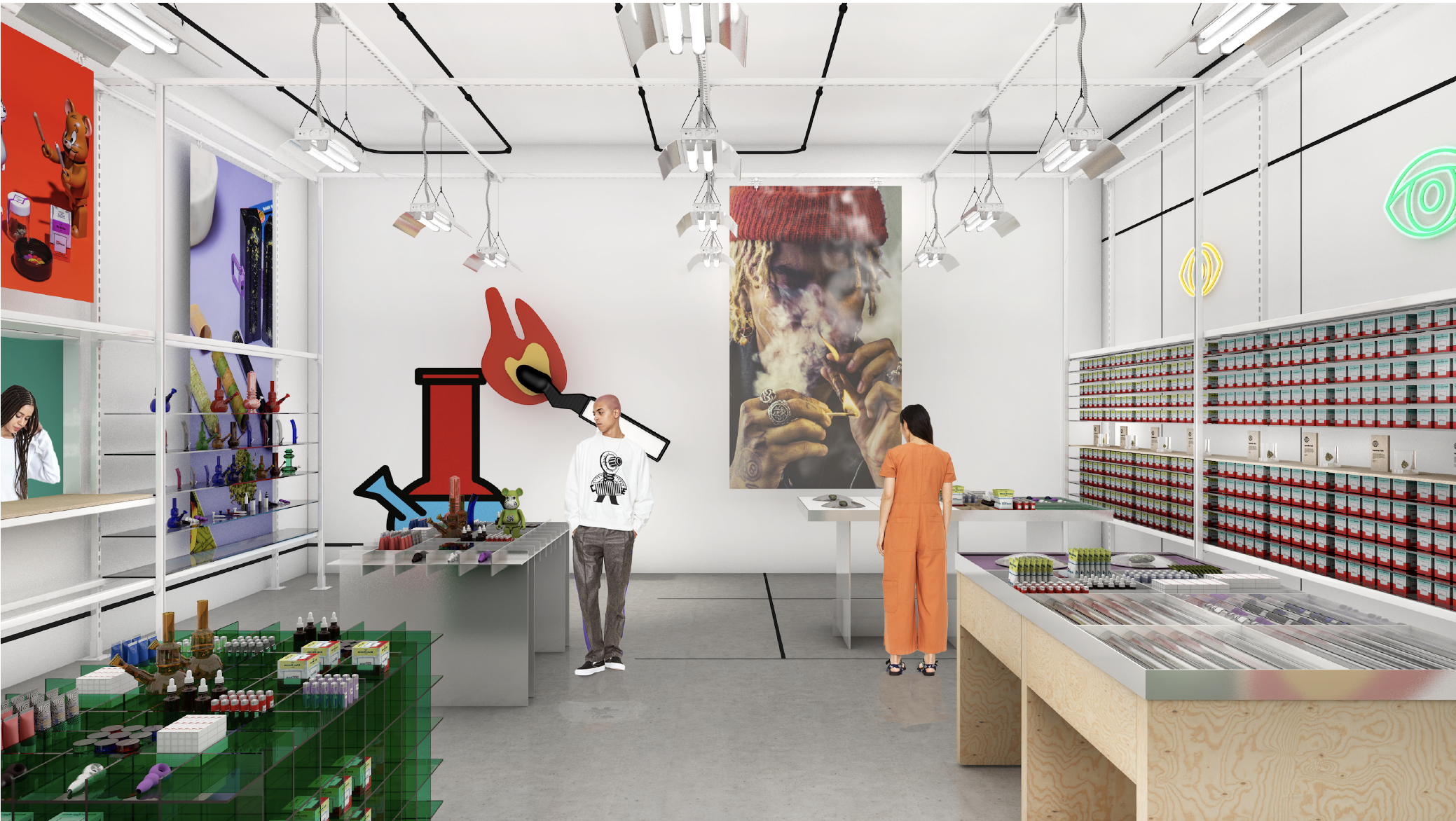
There is a shift in aesthetic on entering the store, the warmer timber gives way to a monochromatic shell punctuated by art and product, for clear contrast in product presentation & intuitive wayfinding. The store space draws cues from our utilitarian cultivation facilities.


Perimeter system
The perimeter system construction references grow racks, using a powder coated punched steel channel. The structure is an easily scalable application to any site and gives convenience-style product density and order. Extending the frame across the store allows for lighting and graphics to plug in.


Modular Design inspired furniture
A family of midfloor units brings character to the space. The table tops remain consistent allowing the plug-in accessories to fit in any location, while providing flexibility in merchandising and educational moments via digital touch points.

Grid systems
The language of the grid is expressed like a waffle in part of the midfloor family, allowing for clearly arranged information and making consistent user experiences. They include the rule of thirds, golden section, single-column, multi-column, modular, baseline, and responsive grid systems. Finish options include a steel finish, translucent acrylic, or lacquered MDF.

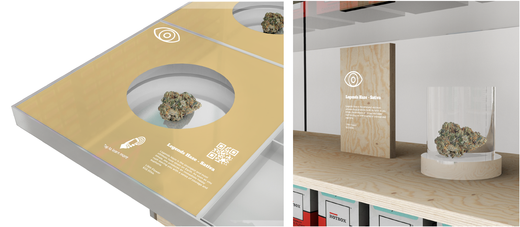
Learning Design & Magic ✨
Magnified acrylic cases let customers view & smell cannabis. Simple graphic devices give bite-size product info. Using sativa, indica & hybrid colors and the Hotbox eye icons makes the journey more intuitive.
Additionally, we added QR codes and Near-field communication (NFC) stickers on merchandising accessories for a seamless magical feeling experience, allowing customers to quickly tab & access important product information via their mobile devices.

A separate effort to build a database of information was executed to support our “explore” sections concept to educate customers, and lighten the load of informational responsibility from budtenders/sales people.


More Grids: Cash Hatches
Where workable on-site, cash hatches are included with analog menu boards. The hatches are contained within the perimeter system to provide counter extension and adjacent products. Where free-standing cash desks exist, back-lit waffle cladding can be introduced.


Artwork and infographics
Artwork and infographics can be used as a stand-alone wall installation or tie into display furniture, to educate customers on things like terpenes or guide customers to quick facts, value propositions, or to which cultivar is best suited for them.


Tool Box Summary
Design toolbox - entrance

Design toolbox - furniture

Design toolbox - art, graphics, signage

Final Steps
→ Product deep dive to confirm SKU counts, density, graphic communication
→ Graphic assets development, brand imagery selection
→ Partnered with a local architect and a joinery manufacturer to produce fixtures and furniture pieces
→ Updating POS systems and QR/NFC experience with the current knowledge base for product info, benefits, and effects.
Bringing it All Together
LAUNCHING THE DESIGN SYSTEM: toolBox ACROSS THE Retail Ecosystem
Designing and Implementing a Design System & redefining our retail experiences was no easy feat. In order to provide the best experience and value to our customers and convince all the different stakeholders that this was a good investment, we had to jump through several hoops. We kept our eyes on the prize and used data to illustrate how this could be an invaluable strategy for the business.

Results so far
This systematic strategy has been applied to 6+ retail locations and it is available to customers throughout southern California, after going through an Alpha Testing period at our flagship store (the space displayed in this case study was based on).
Here are some of the amazing results we achieved in just one year:
→ 6+ Hotbox branded retail locations have implemented this concept/strategy
→ Cost savings of 19%-33% of our average build cost per location
→ Social media engagement has risen significantly since the inception of the first 3 stores, supporting local discoverability across cities on social (especially Instagram)
→ An average rating of 4.6 stars on yelp, weedmaps, leafly, cannaSOS, and other customer review directories.
→ As a strategic retail partner to the Cookies brand, & this strategy has also been implemented by Cookies & Lemonade stores in California & Florida.