
Defining Color: Principles, Theming, Design Tokens
Making U.S. Banks Design System flexible & scalable with Design Tokens
The Challenge
Designers and partner brands (a large source of revenue for us) were plagued by our current design systems limitations around color & how theming was able to be expressed across U.S.Bank’s white-labeled products.
The current impacts on the end-users involve:
→ The current system didn’t allow brands to fully express their pallets on the products they’re white-label
→ Deviation from our design system was creating the need for custom code to solve for theming, adding strain on our design and development resources
→ White-labeling for our 1500+ partner brands was creating production bottlenecks, increasing time to solution with designers and brand liaisons, and development.
The objective was to find a solution that increases the flexibility of our color system, speeds up production, and allows more focus on strategic work. This solution came to life as a redefining of our approach to the design systems’ color tokens schema and how it can enable designers and engineers to make the redundant parts of theming more streamlined so that they can focus on solving design problems.

User Need
Designers and Developers need a way to move faster, improve white-labeling time to market, and focus their energy mainly on strategic efforts.
Business needs to provide a competitive and flexible white-labeling service experience for partner brands while providing them with the options to help them stay on brand and retain clients.
My Role
Lead UX Designer, User Research, Design Thinking Facilitator, Accessibility, Selling
Collaborators
DS Core team: A11y Consultant, Content Strategist, USB Shield (DS) Developers (3)
Other collaborators: Designers, Developers, and Product Owners across 9 teams
Kick-off: Gather Insights
I started this project by working through a lot of ambiguity, in relation to how this was to be solved. We knew we had a problem, yet it wasn’t fully defined. We only felt the limitations due to the strain it was putting on our relationships with our partner teams, due to a lengthy process and not always being able to solve for theming in a way that allows brands to express their full-color pallet that follow their brand usage practices.
My Approach:
Gather Insights through immersive research:
Competitive analysis
Surveying cross-team Designers, Developers, & Product managers
Value proposition analysis
Facilitating mapping workshops
Develop a Point of View(s)
Define the strategy & product vision
Design execution, leadership, and oversight


Problem Discovery
To get started, I had an initial discovery session with one of our main partner support teams to understand how the white-labeling workflow and how our design system was being utilized, to produce those products (i.e. web, mobile, & app products). This was a collaborative effort to document usage, designer and partner brand needs, and discover opportunities for improvement.
We discovered their current method was very manual and lengthy, utilizing a pdf form to document color selections per each product’s pages. This included lots of back-and-forth conversations and edits due to accessibility issues, brand alignments, and having each page custom coded by our engineers (working outside of our design system tokens, due to them not being broad enough to handle brands with larger color pallets than its inception which was made for U.S. Banks simpler pallet). In learning this I then set out to learn about what other design teams are being challenged with using our design system and in what ways they stay within usage guidelines and when they need to break those rules. In understanding this I started to see that the limitations were rooted in how our design tokens lack flexibility in how they can be applied to a brand pallet and provide better contrast within our components and products, even more so when products use light and dark modes.
Point of VIew
Next, I defined a point of view to set the direction for a deeper dive and possible approach to a solution.
Design tokens are design decisions that are stored in a platform-agnostic way. This means that decisions such as colors, typography, border radii, spacing etc. are all collected and stored in one place so that other tools can grab them or alter them into something that a development team can use. Design tokens are meant to bridge the gap between design and development by allowing one source of truth for both parties.
Designers create design tokens for various things such as colors, margins, borders etc. These design tokens can then be exported from Figma or similar tools as JSON objects and used in a theme component that can be then applied to our components. That way everything can be then styled, using CSS in JS or CSS vars, and all our components are ready to accept new tokens or be used with different modes or themes.

Digging Deeper
Next, I interviewed 8 teams over several sessions, that were using our design system to include designers, product managers, A11y consultants, and partner brand liaisons. The purpose of these interviews was to understand how teams approached color theming and usage, especially as it relates to our current design systems guidance. Now that we understood that the tokens may be the limiting factor, I needed to build a case for how these limits were affecting production, resourcing, and our bottom line as it relates to our partner-brand relationships. This edit to the DS was not a small effort and would require the restructuring of our design tokens, as they relate to our entire component and pattern library… Meaning we needed to tokenize components to allow flexibility in theming them and setting templates for our white-labeled products.

Fostering collaboration
Synthesis Insights and Feedback
After synthesizing the interview findings, I started to map out an approach to how we can tokenize components to offer the flexibility that was lacking in the current schema. Because our design system was based on Atomic Design, I then started to look for solutions in understanding how we structure color around our patterns:
ELEMENTS
The most basic building blocks which can’t be broken down further without losing their meaning. Ex: Color, Typography, Iconography, Motion
COMPOUNDS
Composed of multiple Elements, and iterations can be created by combining Elements with real user needs. Ex: Date Picker, Toggle, Slider, Search
PAGES
Collections of Compounds functioning as a cohesive unit to make a complete workflow. Ex: Forms, Step Process, Getting Started

Lets see what this can look like
I setup a session to workshop with our design system teams, designers (2) and engineers (3), to address designer needs on specific components, while applying partner brands’ colors our produtcs to explore the range of of our current tokens, and the possibilities of how they can be expanded to address better brand expression and accessibility design issues that arise for some colors usage in specific uses (i.e AA, AAA, etc.).
Iterating on the Point of view
From these exercises and evaluations, I created a new point of view in effort to continue to define the strategy & product vision.
Defining Theme-ablity
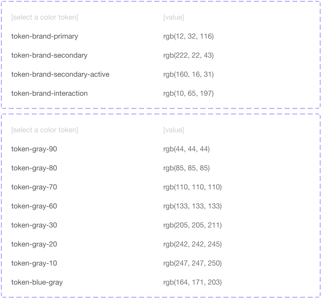
Starting with a look at a macro view of what designers & brand partners need from a theming perspective, I was then able to strart defining the macro elements. I applied Purpose as a concept, with the aim of making tokens clear and understandable in what that token was for. From previously syntehsised research, I mapped out which components needed to be themable and at what length (color: base, borders, elevation, shadows, or shapes, size, and fonts).


There are Levels to This
Generally, roles are a natural element of human daily concept-forming. Roles in programming languages enable objects to have changing interfaces, as we see in real life - things change over time, are used differently in different contexts, etc.
In understanding role-oriented programming, we’ve focused on the idea of Purpose, where the namespace of a thing is directly tied to the role they play in the interface. This naming direction also allows us the opportunity to create core rules that are use-case based, intuitive, and ultimately create an easily learnable language that helps teams build faster and systematically.
We needed more role levels to realize tokens’ promise as a way to centrally record and widely reuse purposeful visual decisions.
Goal: in token naming is to be as clear as possible in its naming/description, & create more levels that lead to more complicated yet specific tokens.
A token's name needs to be specific enough to clarify its place in taxonomy and token type.
Through a series of workshops and presenting the concepts DS designers and development we go team buy-in. Workshops and working sessions included a color mapping exercise to the new token schema to show how this solution solves for color modes (example below), as well as, going to through all components and applying the new schema so devs can understand the direction and give feedback on how it helps them and the challenge at hand. Luckily, our devs bought in and the final step was getting leadership buy-in.


Design Token Concept - Purpose Definitions

Color Concept: Outliers & suggestions to explore further
Getting Buy-in
Once the concept was finalized, the last step was getting leadership buy-in, especially due to the heavy lift and implications this had on restructuring our design tokens schema. So, we condensed our previous workshop into a show-and-tell presentation of the concept and showed how color modes can be solved with a condensed version of our color mapping exercise. The final piece was a demo I designed and created with development as a Theming Playground working prototype (reference images), that allowed any user (i.e designers & non-designers) to simply theme at a component level, edit the colors of components attributes, and at of product template level, which would allow users to edit grouped attributes on any given product page or group of pages to match their brands. The prototype include notifications that let the user know when specific WCAG requiements were not met and in which areas (i.e. aa, aaa, etc.). This really helped drive a complex explanation of tokens to visualize the expanded opportunities this new token schema would provide.
Results so far
The new Design Tokens schema has been updated and released in April 2022 and it is available for teams, after going through an Alpha & Beta Testing period.
Here are some of the amazing results we achieved in just a few months:
20+ Teams from across all U.S. Bank segments reached out to be part of Beta (Including International teams).
All brand partner teams have already started production using the new Design Tokens.
The update has helped alleviate tensions between partner brands and USB, helping retain our highest priority clients.
I was invited to produce a webinar about the Power of Design Tokens and speak to a cross-org audience of developers and designers.
The system was highlighted on various cross-org presentations on our 2022 USB UX & Product Design Summit.